BioCentral IBBioCentral IB
IB Biology · Theme C · C4.1

Populations and communities

From counting a handful of quadrats to explaining a decade-long lynx-and-hare cycle, this lesson follows populations from a single defining trait — members that interbreed — through the maths of growth and the negative feedback that keeps it in check, into the full cast of relationships, tests and controls that shape a real community.
Guiding question

How do populations grow and interact within communities, and what factors determine the structure and dynamics of ecosystems?

Part one

Measuring populations

C4.1.1 – C4.1.4
C4.1.1

One species, one breeding group

A population is a group of interacting organisms of the same species living in the same area at the same time, whose members normally breed with one another.
  • Two groups of the same species are treated as separate populations when a barrier — distance, a mountain range, an unconnected lake — normally prevents individuals from interbreeding.
  • This reproductive isolation, not physical differences in size or appearance, is the defining test used to distinguish one population from another.
  • If the barrier disappeared, the two groups would simply become one population again — separation alone does not create a new species.
Why it mattersA population is not just "organisms in an area" — that fits a community; a population is specifically one interbreeding species.
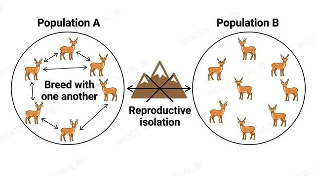
A flat diagram of two same-species deer populations in separate circles labeled Population A and Population B, with breeding arrows inside each circle and a mountain-range barrier blocking a crossed-out arrow between them labeled reproductive isolation
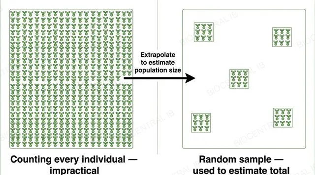
A flat diagram contrasting a field completely covered in plant icons labeled counting every individual impractical, against the same field with a scattered random subset of small sample squares labeled random sample used to estimate total, with an arrow labeled extrapolate to estimate population size
C4.1.2

Why sample instead of count

Ecologists estimate population size by random sampling rather than counting every individual, because a complete census of most natural populations is impractical or impossible.
  • Individuals may be numerous, mobile, hidden, or spread across a large or inaccessible area — sampling a representative subset and extrapolating gives a workable estimate at far lower cost.
  • Sampling must be random: if a researcher subjectively picks "typical-looking" or convenient sites, the estimate becomes systematically biased rather than just imprecise.
  • Even perfectly random sampling still leaves sampling error — an unavoidable difference between the estimate and the true population size, distinct from bias.
Why it mattersRandom sampling removes systematic bias; it does not, and cannot, eliminate sampling error altogether.
C4.1.3

A frame, randomly placed

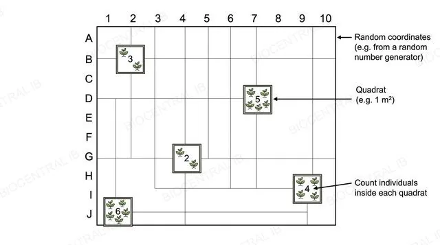
Random quadrat sampling estimates population size for sessile or slow-moving organisms — plants, limpets, barnacles — by counting individuals inside a fixed sample area placed at random positions.
  • Quadrat positions are set using random coordinates, for example from a random number generator over a grid — never chosen because a spot "looks representative," which reintroduces bias.
  • The method only works if individuals stay within the quadrat long enough to be counted, which is why it suits sessile or slow-moving organisms rather than fast-moving animals.
  • Counts from enough randomly placed quadrats are averaged to estimate density across the whole study area.
Why it mattersQuadrats are not a general-purpose method for any organism — their validity depends entirely on the organism staying still long enough to count.
A flat diagram of a numbered and lettered grid over a field with five small quadrat frames placed at random coordinates, each containing a counted number of plant icons, labeled random coordinates and quadrat 1 square metre
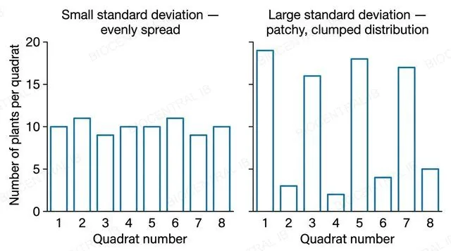
A flat two-panel bar chart with numeric y-axis values for number of plants per quadrat, left panel showing eight similar-height bars labeled small standard deviation evenly spread, right panel showing eight wildly varying bars labeled large standard deviation patchy clumped distribution
C4.1.3 · Skills

What the spread is telling you

The standard deviation of the mean number of individuals per quadrat measures how evenly a population is spread across the sampled area — students are not expected to memorise its formula, only to interpret it.
  • A small standard deviation means quadrat counts cluster close to the mean — the population is distributed fairly evenly across the field.
  • A large standard deviation means counts vary widely between quadrats — the population is patchy or clumped rather than evenly spread.
  • Standard deviation says nothing about population size itself — a large or a small total population can each show either a small or a large spread.
Why it mattersConfusing "spread across the area" with "size of the population" is the most common misreading of this statistic.
C4.1.4 · Skills

Marking a sample, twice

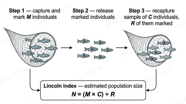
Capture-mark-release-recapture estimates population size for motile organisms using the Lincoln index: N = (M × C) ÷ R.
  • A first sample of M individuals is caught, marked without affecting survival, and released to mix randomly back into the population.
  • A second sample of C individuals is later caught; the marked proportion of that sample (R out of C) is assumed to reflect the marked proportion of the whole population (M out of N).
  • Rearranging that proportion — M/N = R/C — gives the formula used to estimate N.
Why it mattersR, the marked recaptures, carries the new information — easy to mistake for C in the formula.
A flat three-step left-to-right diagram: capture and mark M fish, release marked fish, recapture sample of C fish with R marked, with the Lincoln index formula N equals M times C divided by R shown in a boxed panel below
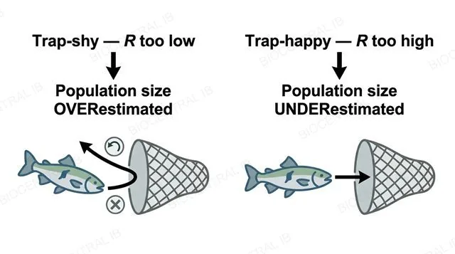
A flat two-panel diagram, left panel labeled trap-shy R too low leading to population size overestimated, right panel labeled trap-happy R too high leading to population size underestimated
C4.1.4 · Skills

When the assumptions break

The Lincoln index is only valid if marked individuals mix randomly, marks are not lost, catching is random, and the population is closed — no significant births, deaths, immigration or emigration between samples.
  • If marked individuals become "trap-shy" and avoid recapture, R is artificially low — since R sits in the denominator, this inflates N, overestimating the population.
  • If marked individuals become "trap-happy" and are recaptured more easily, R is artificially high, deflating N and underestimating the population.
  • The direction of the error can be deduced from which of M, C or R is affected — not just labelled "wrong."
Why it mattersSaying which direction an estimate is skewed, and why, shows real understanding rather than just quoting the formula.
Quick check

A researcher marks 60 crabs and releases them. Two days later she catches 50 crabs, but only 3 are marked — far fewer than she expected, because the marked crabs seem to be actively avoiding her traps. What effect does this have on her Lincoln index estimate?

No effect — trap-shyness does not change the calculation
The population size will be overestimated, because R (marked recaptures) is artificially low
The population size will be underestimated, because R is artificially high
The estimate becomes impossible to calculate
Correct answer: overestimated. N = (M × C) ÷ R — R is in the denominator, so trap-shy behaviour lowering R inflates the calculated N, making the population look larger than it really is.
Part two

Population growth

C4.1.5 – C4.1.8
C4.1.5

The ceiling an environment sets

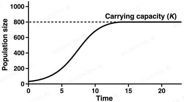
Carrying capacity (K) is the maximum population size that an environment can sustain, set by whichever resource — food, water, space, nesting sites — runs out first.
  • Below K, resources remain enough per individual for the population to keep growing; at K, growth levels off as resources become fully used.
  • K is not a fixed number for a species — it depends on the specific environment, and can rise or fall as resource availability changes, for example with drought, rainfall, or habitat destruction.
  • As a population nears K, competition for the limiting resource intensifies between individuals of that same species.
Why it mattersTreating K as a permanent property of a species, rather than of a species-in-an-environment, is a common and testable misconception.
A flat line graph with numeric axes showing population size rising then flattening into a plateau, with a horizontal dashed line labeled carrying capacity K marking the plateau level
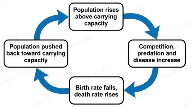
A flat circular feedback loop diagram with four boxes connected by same-direction arrows: population rises above carrying capacity, competition predation and disease increase, birth rate falls and death rate rises, population pushed back toward carrying capacity, looping back to the first box
C4.1.6

Pulled back toward the ceiling

Density-dependent factors push a population back toward carrying capacity through negative feedback, with their effect intensifying as population density rises.
  • As density increases, competition for limited resources, the risk of predation, and the transfer of pathogens or pests between individuals all become more severe.
  • These pressures lower the birth rate and raise the death rate, slowing growth and pushing the population back toward K — a self-correcting, negative-feedback response.
  • Density-independent factors, such as a storm or a wildfire, also cause fluctuations, but their impact does not depend on how crowded the population already is.
Why it matters"Density-independent" means the impact doesn't scale with density — not that the factor has no effect on the population at all.
C4.1.7

Growth with nothing in the way

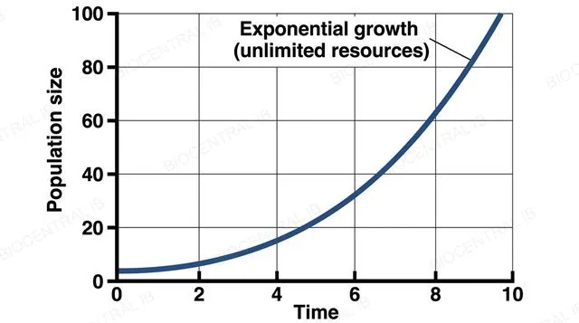
Exponential growth occurs when resources are effectively unlimited relative to population size, so the population grows at a constant per-capita rate, producing a J-shaped curve.
  • This typically happens in the initial phase of colonising a new environment, while numbers are still small enough that competition for resources is negligible.
  • Real populations almost never sustain exponential growth for long — as numbers rise, density-dependent factors increasingly slow growth, and the idealised J-shaped curve is a simplification, not a literal prediction.
  • This nature-of-science point matters generally: models like this curve are useful precisely because they simplify a genuinely more complex real system.
Why it mattersAt least one real case-study population should be studied against this idealised model, not just the abstract shape of the curve.
A flat line graph with numeric axes showing a single upward curving J-shaped exponential growth curve rising steeply from time zero with no plateau and no flat starting phase, labeled exponential growth unlimited resources
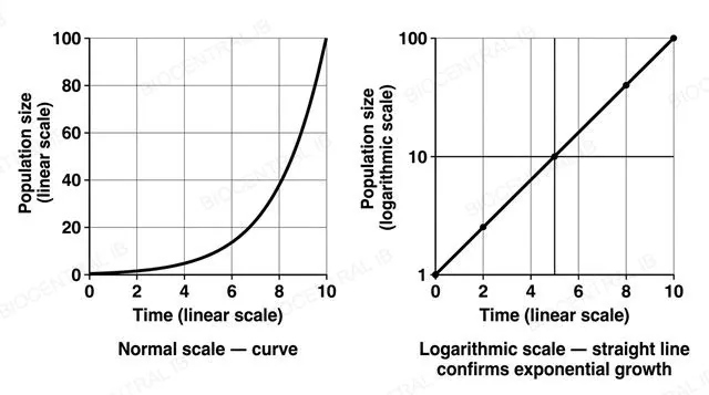
A flat two-panel diagram with numeric axes, left panel a normal-scale graph showing a steeply curving exponential line labeled normal scale curve, right panel a logarithmic-scale graph showing a perfectly straight diagonal line labeled logarithmic scale straight line confirms exponential growth
C4.1.7 · Skills

Turning a curve into a line

Whether a population is truly growing exponentially can be tested by plotting population size on a logarithmic scale against time on a normal, linear scale.
  • Exponential growth follows N = N₀e^(rt); taking the logarithm of both sides gives a straight-line relationship between log(N) and time.
  • On an ordinary linear-linear graph, exponential growth is a curve that gets steadily steeper, which is hard to distinguish confidently from other fast-growth patterns by eye.
  • On the log-linear plot, genuine exponential growth appears as a straight line — any curvature away from a straight line shows the growth is departing from the exponential model.
Why it mattersThis turns a subjective "does this curve look exponential?" judgement into an objective straight-line test.
C4.1.8 · Skills

Growth that curves over

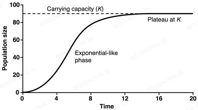
The sigmoid (S-shaped) population growth curve models growth that starts fast and then levels off at carrying capacity — in this idealised model, a flat lag phase is not expected at the start.
  • The curve rises steeply almost from the start, then bends over as density-dependent factors take effect, and flattens into a plateau at K.
  • Yeast and duckweed are recommended for practically collecting this data — both proliferate rapidly under simple conditions and can be counted repeatedly.
  • Real experimental data, unlike this idealised model, often does show an initial lag — a reminder the curve is a simplification, not a perfect real-world description.
Why it mattersDrawing a flat lag segment onto the idealised sigmoid curve itself is a specific, avoidable error.
A flat line graph with numeric axes showing an S-shaped sigmoid curve rising immediately from time zero with no flat lag segment, curving through a steep middle phase, then flattening into a plateau at a horizontal dashed line labeled carrying capacity K
Quick check

The idealised sigmoid growth curve rises immediately from time zero with no flat lag segment, but a real yeast culture in a flask often shows a genuine flat lag phase before growth speeds up. What does this contrast best illustrate?

The sigmoid model is wrong and should be abandoned
Real yeast populations never actually follow a sigmoid pattern
The sigmoid curve is an idealised graphical model — a simplification that can still leave out features, like a lag phase, seen in real data
Carrying capacity does not apply to yeast populations
Correct answer: models are simplifications. Both the exponential and sigmoid curves are idealised graphical models; real populations can show extra features, such as an initial lag phase, that the simplified model does not include.
Part three

Communities and interactions

C4.1.9 – C4.1.18
C4.1.9

Same species, two outcomes

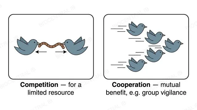
Individuals of the same species can either compete for limited resources or cooperate for mutual benefit — both are intraspecific relationships, since they occur within one species.
  • Intraspecific competition arises because members of the same species share identical resource requirements, so it is often more intense than competition between different species.
  • Intraspecific cooperation — such as group hunting, shared vigilance against predators, or cooperative care of young — can raise the survival or reproductive success of the group as a whole.
  • Whether competition or cooperation dominates in a given population depends on the specific resource and behaviour involved, not a fixed rule for the species.
Why it matters"Intraspecific" specifically means within one species — this is what separates it from every interspecific relationship covered next.
A flat two-panel diagram, both panels showing the same species of bird icon, left panel showing two birds pulling opposite ends of a worm labeled competition for a limited resource, right panel showing five birds flying together labeled cooperation mutual benefit
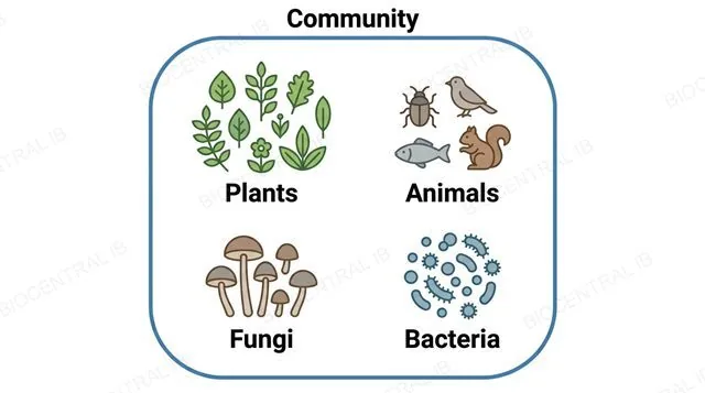
A flat diagram of one large rounded boundary labeled community containing four labeled clusters of icons: plants, animals, fungi, and bacteria
C4.1.10

Every population, together

A community is all of the interacting populations of different species living in an ecosystem, comprising every population present — plants, animals, fungi and bacteria alike.
  • A community is broader than a population, which is only one species, but narrower than an ecosystem, which also includes the abiotic environment such as soil, water and climate.
  • Members of a community interact through the whole range of relationships covered in this topic — feeding, competing, and cooperating across species.
  • A pond community, for example, includes its fish, plants, algae and bacteria, but not the water or dissolved oxygen those organisms live in.
Why it mattersMixing up population, community and ecosystem is one of the most common vocabulary errors in this entire topic.
C4.1.11

Consumer relationships, three ways

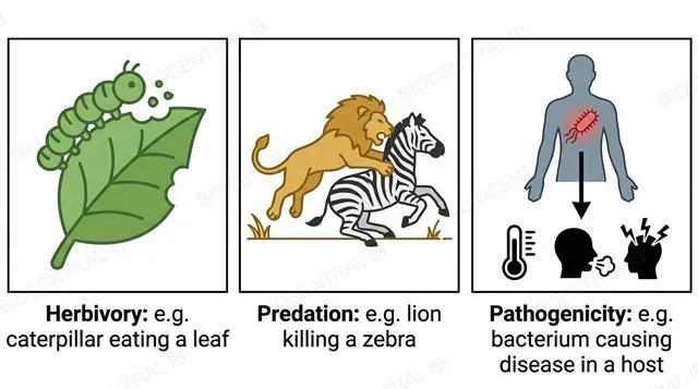
Herbivory, predation and pathogenicity are three categories of interspecific relationship in which one species feeds on, kills, or causes disease in another.
  • Herbivory is an animal feeding on a plant, such as a caterpillar eating a leaf — the plant is typically damaged but not killed outright.
  • Predation is one animal killing and eating another, such as a lion killing a zebra — a direct, usually fatal, consumer-resource interaction.
  • Pathogenicity is a microorganism causing disease in a host, such as a bacterium infecting a human — harm arises from infection rather than direct consumption.
Why it mattersEach category needs at least one specific, nameable example — a vague description of "one species harming another" is not enough on its own.
A flat three-panel diagram: a caterpillar eating a leaf labeled herbivory example caterpillar eating a leaf, a lion catching a zebra labeled predation example lion killing a zebra, a pathogen inside a sick human silhouette labeled pathogenicity example bacterium causing disease in a host
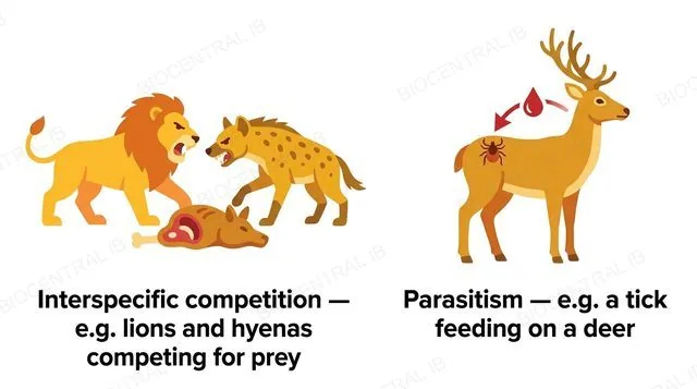
A flat two-panel diagram: a lion and a hyena both reaching for the same carcass labeled interspecific competition example lions and hyenas competing for prey, a tick attached to a weakened but alive deer labeled parasitism example a tick feeding on a deer
C4.1.11

Sharing, and taking slowly

Interspecific competition and parasitism complete the set of interspecific relationships, each a distinct pattern of harm between two different species.
  • Interspecific competition occurs when different species compete for the same limited resource, such as lions and hyenas competing for the same prey — neither directly consumes the other.
  • Parasitism is one species living on or in a host and feeding from it over time, weakening but usually not killing it, such as a tick feeding on a deer.
  • Distinguishing the two matters: a parasite typically keeps its host alive, since a dead host is no longer a food source.
Why it mattersMatching each relationship name to the correct real-world example — not just recognising the surface topic — is the actual skill being tested.
C4.1.12

When both sides gain

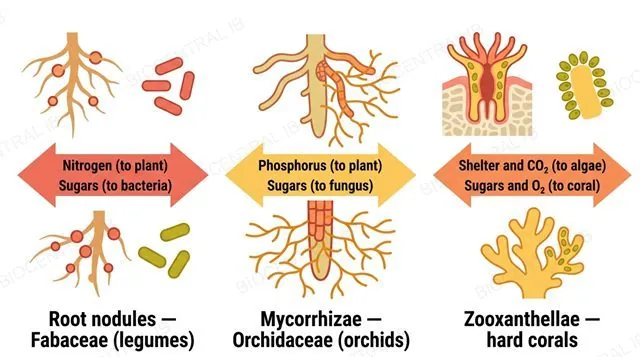
Mutualism is an interspecific relationship that benefits both species involved, illustrated here by three required examples: root nodules, mycorrhizae, and zooxanthellae.
  • Root nodules in legumes (Fabaceae) house nitrogen-fixing bacteria: the bacteria receive carbohydrates from the plant, and the plant receives usable nitrogen it could not otherwise obtain from the air.
  • Mycorrhizae in orchids (Orchidaceae) are fungal partners that extend a root's effective surface area, increasing phosphorus uptake in exchange for sugars from the plant.
  • Zooxanthellae are photosynthetic algae living inside hard coral tissue, supplying the coral with sugars and oxygen in exchange for shelter and carbon dioxide.
Why it mattersMutualism is an exchange, not altruism — naming the specific benefit each partner receives is what full marks require.
A flat three-panel diagram, each panel showing a two-way arrow between two partners with what is exchanged labeled: legume root nodules and bacteria exchanging nitrogen and sugars, orchid roots and fungus exchanging phosphorus and sugars, hard coral and zooxanthellae exchanging shelter and sugars
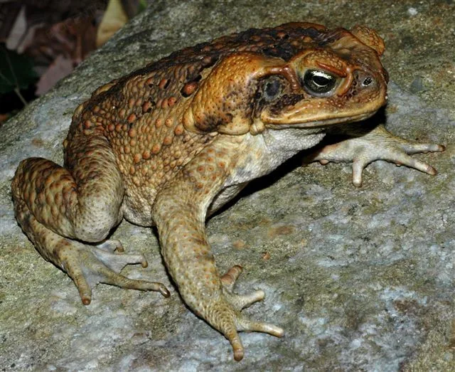
A real photograph of a cane toad (Bufo marinus), an invasive species introduced to Australia in 1935
Froggydarb / Wikimedia Commons · CC BY-SA 3.0
C4.1.13

An advantage that isn't earned

Resource competition between an endemic and an invasive species can give the invader a competitive advantage in acquiring resources, which is one basis for it becoming invasive.
  • Cane toads, introduced to Australia in 1935 to control a sugar-cane beetle, left behind the specialist predators and parasites that controlled them in their native range — the "enemy release" advantage.
  • Freed from these natural checks, an invasive species can out-compete endemic species for shared resources such as food or breeding sites, even without being intrinsically "superior."
  • Endemic species may also lack evolved defences against a genuinely new invader, compounding the competitive imbalance.
Why it mattersAn invasive species is rarely dominant in its native range — its advantage comes from context, not innate superiority.
C4.1.14 · NOS

Suggestive is not proof

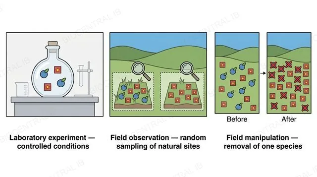
Interspecific competition is indicated, but not proven, if one species is more successful in the absence of another — three research approaches can test for it more rigorously.
  • Laboratory experiments grow two species together and separately under controlled conditions, isolating competition from other variables.
  • Field observations use random sampling to compare sites where both species occur against sites where only one does, looking for a consistent pattern.
  • Field manipulation experimentally removes one species from a plot and observes whether the remaining species' population changes — a more direct test than observation alone.
Why it mattersRecognising the difference between an experiment (a variable is manipulated) and an observation (patterns are recorded without intervention) is a specific nature-of-science skill here.
A flat three-panel diagram: a sealed container with two species on a lab bench labeled laboratory experiment controlled conditions, a landscape with two sites compared under a magnifying glass labeled field observation random sampling, a field shown before and after one species is removed labeled field manipulation removal of one species
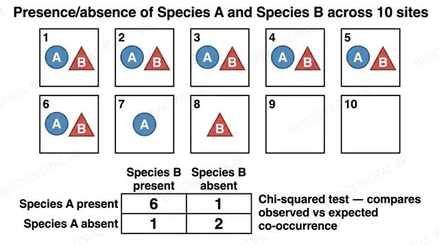
A flat diagram of a grid of ten sampling sites showing presence or absence of Species A and Species B, with a two by two table of observed counts six one one two, labeled chi-squared test compares observed versus expected co-occurrence
C4.1.15 · Skills

Testing whether two species avoid each other

A chi-squared test can be applied to the presence or absence of two species across several sampling sites, exploring whether their distributions are associated.
  • Each site is recorded as having both species present, only one, or neither, building an observed-frequency table like the one shown.
  • The chi-squared test compares these observed counts with the counts expected if the two species were distributed completely independently of each other.
  • A significant difference between observed and expected counts can provide statistical evidence for interspecific competition — sites where one species is present being less likely than expected to also contain the other.
Why it mattersThis gives the "one species more successful in the absence of another" idea from the previous statement an actual statistical test.
C4.1.15 · Skills · Worked example

Working through the numbers

1. Observed values (from the grid)

6 sites had both species, 1 had only Species A, 1 had only Species B, and 2 had neither. Row totals: A present = 7, A absent = 3. Column totals: B present = 7, B absent = 3. Grand total = 10 sites.

2. Expected values (if the species were independent)

Expected = (row total × column total) ÷ grand total, for each cell: both present = (7×7)/10 = 4.9; A only = (7×3)/10 = 2.1; B only = (3×7)/10 = 2.1; neither = (3×3)/10 = 0.9.

3. Chi-squared statistic

χ² = Σ (O − E)² ÷ E for all four cells:
(6 − 4.9)² ÷ 4.9 = 0.25  +  (1 − 2.1)² ÷ 2.1 = 0.58  +  (1 − 2.1)² ÷ 2.1 = 0.58  +  (2 − 0.9)² ÷ 0.9 = 1.34
χ² = 2.75 (degrees of freedom = (2−1)×(2−1) = 1)

4. Conclusion

The critical value at p = 0.05 with 1 degree of freedom is 3.84 (data booklet). Because 2.75 is less than 3.84, this result is not statistically significant — this particular sample does not provide strong evidence of association between the two species, even though the raw counts might look suggestive at a glance. A real study would need a larger sample before drawing a conclusion either way.

C4.1.16

A cycle that lags behind

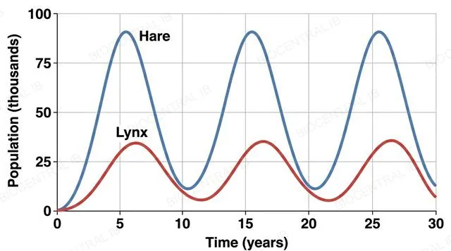
Predator-prey relationships are a real case study of density-dependent control: Canada lynx and snowshoe hare populations, tracked for over a century through Canadian fur-trapping records, cycle together roughly every ten years but out of phase.
  • When hares are abundant, lynx have more food, so cub survival rises — but this takes time, so the lynx peak lags roughly one to two years behind the hare peak.
  • Rising predation, combined with the hares' own food shortage at high density, then crashes the hare population.
  • With less food available, the lynx population crashes too, releasing pressure on the hares and letting the cycle begin again.
Why it mattersThe defining feature of this cycle is the time lag — predators never track prey numbers instantly.
A flat line graph with numeric axes showing two oscillating population curves over time, a high-amplitude hare curve and a lower-amplitude lynx curve whose peaks visibly lag behind the hare curve's peaks
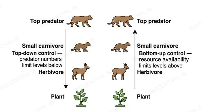
A flat two-panel vertical food chain diagram, left panel showing a downward arrow from a top predator through all trophic levels labeled top-down control predator numbers limit levels below, right panel showing an upward arrow from a producer through all trophic levels labeled bottom-up control resource availability limits levels above
C4.1.17

Control from above, or from below

Populations can be controlled top-down, by predator numbers limiting the levels beneath, or bottom-up, by resource availability limiting the levels above — both are possible, though usually one dominates.
  • In top-down control, a change in predator numbers cascades downward — removing a top predator can let herbivore numbers rise, which then depletes producers.
  • In bottom-up control, a change in resource availability cascades upward — more nutrients or plant growth can support larger populations at every level above.
  • Identifying which dominates in a real community usually needs evidence from an actual change at one trophic level and its knock-on effects.
Why it mattersThese are not mutually exclusive forces globally — the task is identifying which one is dominant in a particular, real community.
C4.1.18

Chemical warfare, two forms

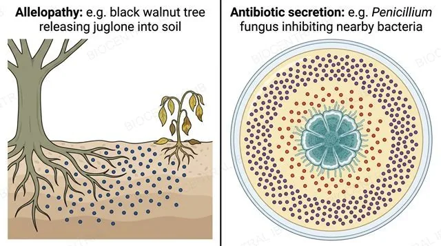
Allelopathy and antibiotic secretion are similar processes in which an organism releases a chemical substance into its environment specifically to deter potential competitors.
  • Allelopathy is a plant releasing a chemical that inhibits the growth of nearby competing plants — the black walnut tree, which releases the compound juglone into the surrounding soil, is a well-documented example.
  • Antibiotic secretion is a microorganism, such as the mould genus Penicillium, releasing a chemical that inhibits the growth of nearby competing bacteria.
  • Both processes give the producing organism a competitive edge over neighbours without any direct physical contact or predation involved.
Why it mattersNaming one specific, real example of each process — not just describing the general concept — is what this statement requires.
A flat two-panel diagram: a tree root releasing chemical particles that wilt a nearby competing plant labeled allelopathy example black walnut tree releasing juglone into soil, a mould colony on a petri dish creating a clear zone with no bacterial growth labeled antibiotic secretion example Penicillium fungus inhibiting nearby bacteria

Where this shows up again

C1.3 · Photosynthesis
Energy for food chains originates from photosynthesis (C1.3). Explain why the efficiency of photosynthesis limits the total energy available to support higher trophic levels.
C3.1 · Integration of body systems
Predator-prey cycles demonstrate negative feedback regulation in ecosystems. Compare this with negative feedback in blood glucose regulation (C3.1).
B4.2 · Adaptation to environment
Climate change alters the distribution of species. Using the niche concept (B4.2), explain why some species can shift their range while others face extinction.
C4.2 · Transfers of energy and matter
Carbon stored in fossil fuels was originally fixed by photosynthesis millions of years ago. Explain why burning fossil fuels represents a transfer of carbon from the long-term geological cycle to the short-term atmospheric cycle.

C4.1 Populations and communities — one-page recap

Screenshot this slide to revise from

Defining a population
  • Population: same species, interbreeding; separated by reproductive isolation, not just distance.
  • Sample rather than census — sampling must be random to avoid bias; some sampling error is unavoidable.
Measuring populations
  • Quadrats (sessile organisms) — small SD = evenly spread; large SD = patchy.
  • Lincoln index: N = (M × C) ÷ R. Trap-shy → R low → N overestimated; trap-happy → R high → N underestimated.
Growth curves
  • Exponential (J-shaped, unlimited resources) tested by a straight line on a log-scale plot.
  • Sigmoid (S-shaped) plateaus at carrying capacity (K) — no lag phase in the idealised model.
Regulation & competition
  • Density-dependent factors (competition, predation, disease) push populations back to K by negative feedback.
  • Intraspecific relationships: competition or cooperation, within one species.
Interspecific relationships
  • Herbivory, predation, competition, parasitism, pathogenicity: one benefits/neutral, other harmed or both harmed.
  • Mutualism (both benefit): root nodules, mycorrhizae, zooxanthellae. Invasive species gain from "enemy release."
Testing & community control
  • Competition tested by lab experiment, field observation, or field manipulation; chi-squared tests species association.
  • Predator-prey cycles (lynx-hare) lag by design; communities show top-down or bottom-up control; allelopathy/antibiotics deter competitors chemically.

A community is never just one story

From a single interbreeding population to a decade-long cycle between predator and prey, every relationship in this lesson is really one thing: a limit, and how life pushes against it.
C4.1 Populations and communities · BioCentral IB
Use ↓ ↑ or click to navigate
01 / 30